Personal Art Map with R
Map art makes beautiful posters. You can find them all over the internet and buy them even framed for your favorite city, area or country. Those posters’ beauty relies on the intricate and beautiful pattern of roads, buildings, parks, rivers, etc., which shape our cities and our mobility. In my research I constantly use those maps as the hardware fabric in which humans interact, move or encounter in urban settings. However, we found that each of us has a distinct mobility pattern around cities, so even people living in the same neighborhood experience the city in a different way.
For my map art, I wanted to create something more personal: a combination of those beautiful street maps with personal mobility. That is, the city and how we navigate it. In this tutorial, you’ll learn how to create those street maps for your city and your mobility. We will use data from Open Street Maps (OSM) and, of course, R. We will also use personal mobility data, which you can input manually. Still, we will learn too how to get it from Google Maps Timeline (if you have your location activated). Part of the material here is based on the tutorial by Christian Burkhart.
Creating the streetmap
The first thing will be to get a beautiful map of a given city’s streets and boundaries. In this case, Boston, the place where I live. To download the streets, we use the osmdata package to query OSM. First, we define our bounding box, i.e. the area where we are going to query OSM:
library(osmdata)
bbx <- getbb("Boston, MA")
But sometimes you want a more specific area, and you can create your own bounding box:
min_lon <- -71.28735; max_lon <- -70.900578
min_lat <- 42.245838; max_lat <- 42.453673
bbx <- rbind(x=c(min_lon,max_lon),y=c(min_lat,max_lat))
colnames(bbx) <- c("min","max")
OSM data has many layers (or “features”). You can find them here. They go from railways, vegetation to streets or points of interest. Let’s see how many of them are related to highway.
available_tags("highway")
## # A tibble: 53 × 2
## Key Value
## <chr> <chr>
## 1 highway bridleway
## 2 highway bus_guideway
## 3 highway bus_stop
## 4 highway busway
## 5 highway construction
## 6 highway corridor
## 7 highway crossing
## 8 highway cycleway
## 9 highway elevator
## 10 highway emergency_access_point
## # ℹ 43 more rows
They are a lot of them, but the main ones are motorway, trunk, primary, secondary, tertiary that distinguish between highways and other roads conecting cities or small towns. Let’s collect them:
highways <- bbx %>%
opq()%>%
add_osm_feature(key = "highway",
value=c("motorway", "trunk",
"primary","secondary",
"tertiary","motorway_link",
"trunk_link","primary_link",
"secondary_link",
"tertiary_link")) %>%
osmdata_sf()
We have 182 lines. Let’s have a look at them. We color them according to the label highway.
require(sf)
ggplot() +
geom_sf(data = highways$osm_lines,
aes(color=highway),
size = .4,
alpha = .65)+
theme_void()
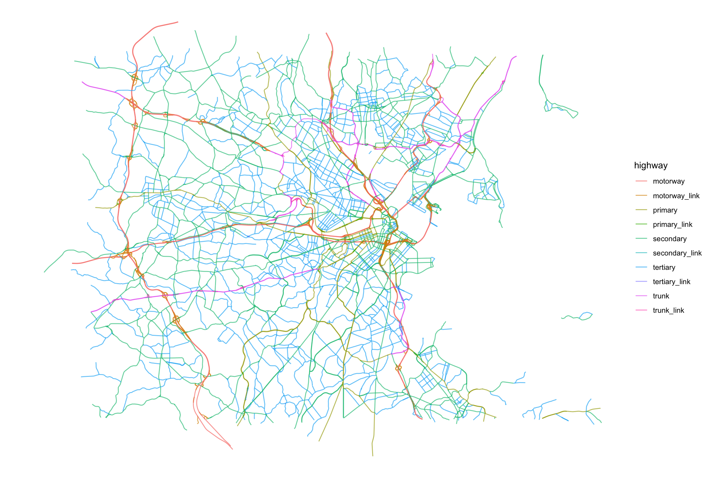
But we are also going to use the small streets, pedestrian paths or living streets that connect our neighborhoods (be advised, this is a large query so you might probably want to save it for later)
streets <- bbx %>%
opq()%>%
add_osm_feature(key = "highway",
value = c("residential", "living_street",
"service","unclassified",
"pedestrian", "footway",
"track","path")) %>%
osmdata_sf()
This time, we have 286 lines. Let’s have a look at them.
ggplot() +
geom_sf(data = streets$osm_lines,
aes(color=highway),
size = .4,
alpha = .65)+
theme_void()
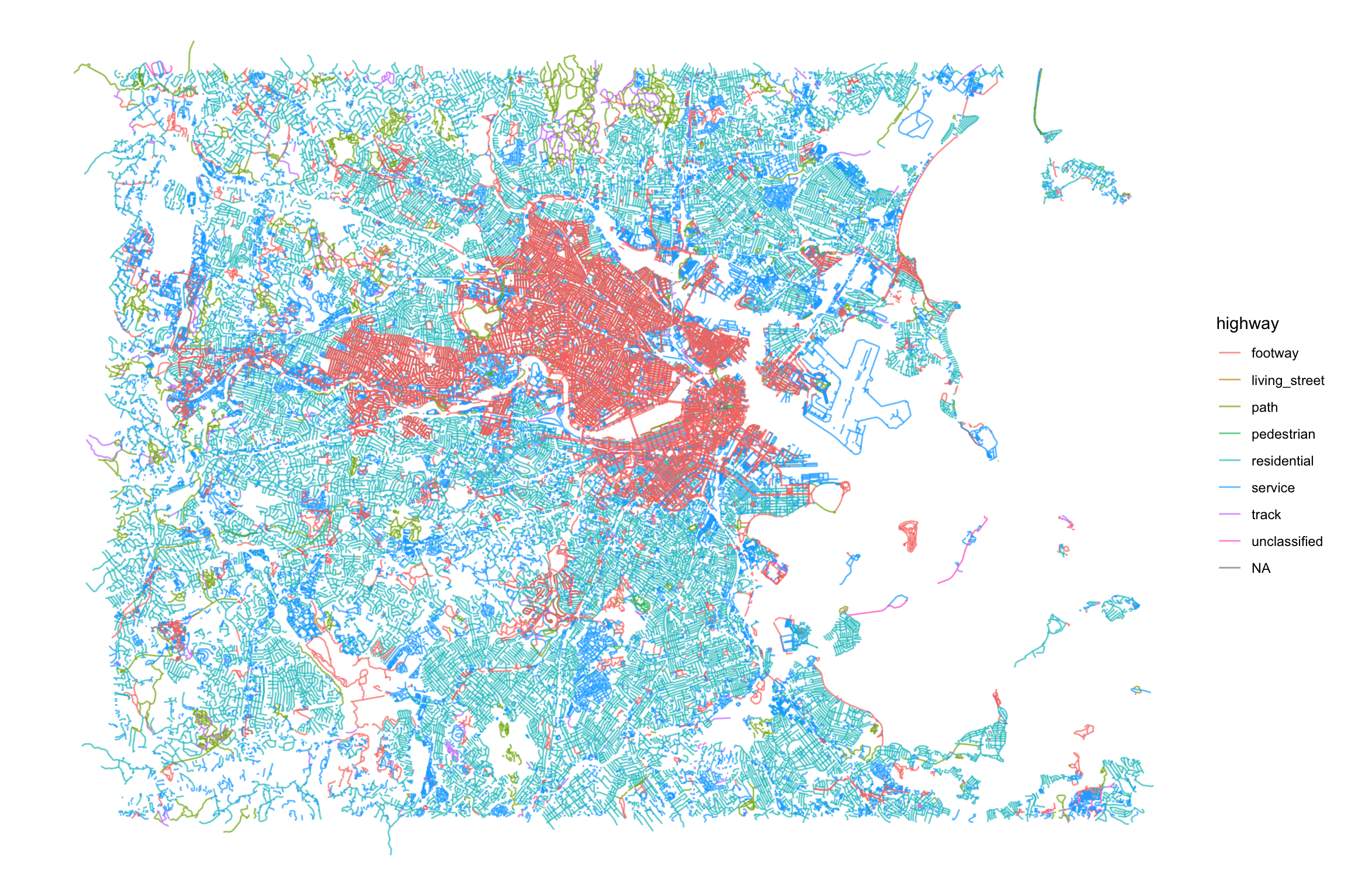
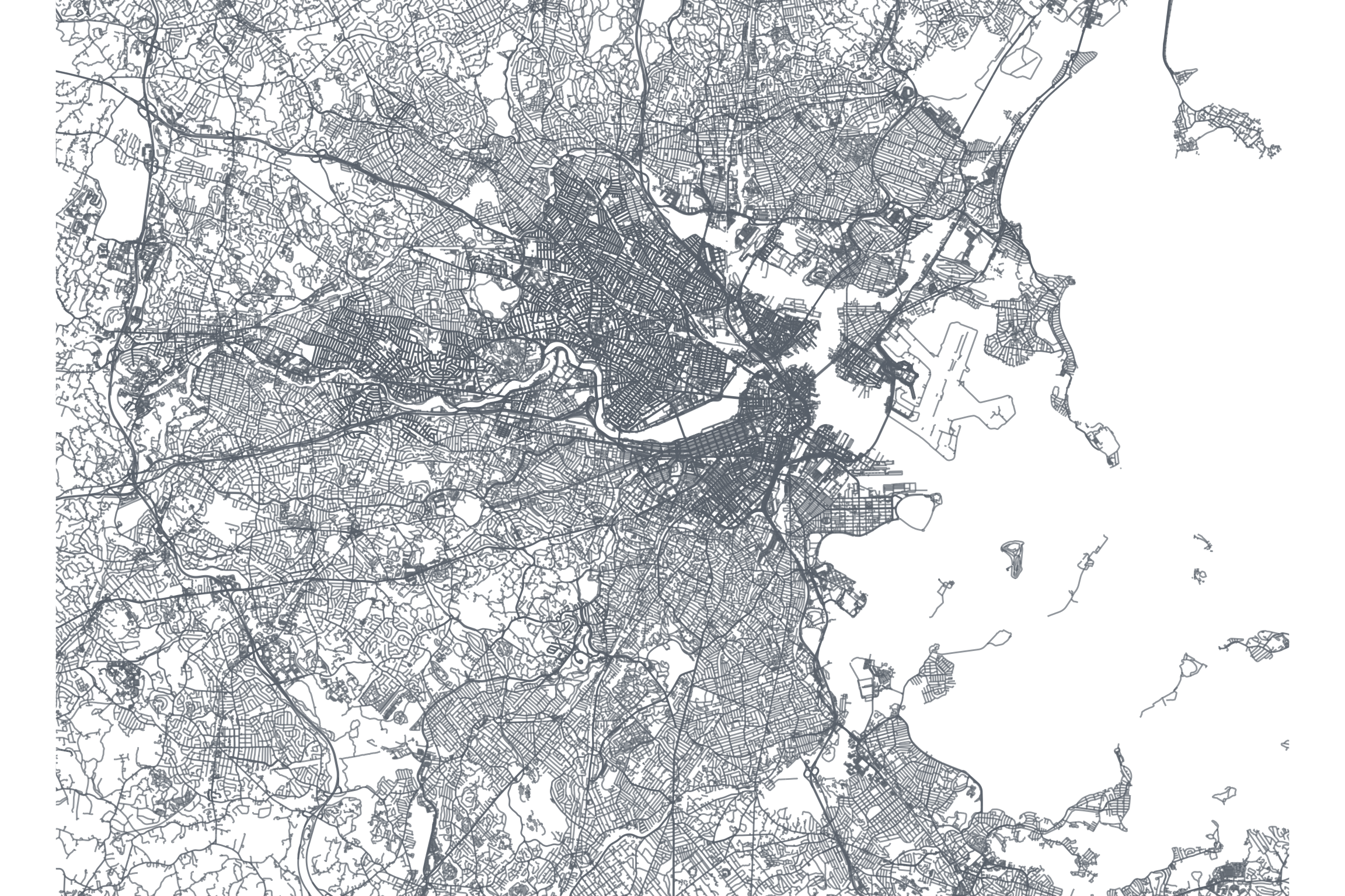
Those maps are already beautiful, right? You probably can see a darker area downtown Boston and Cambridge because of the larger street density there.
Let’s combine them and have different width for the highways and streets to highlight highways’ importance. At the same time, let’s crop the streets to show only those within the bounding box.
color_roads <- rgb(0.42,0.449,0.488)
ggplot() +
geom_sf(data = streets$osm_lines,
col = color_roads,
size = .4,
alpha = .65) +
geom_sf(data = highways$osm_lines,
col = color_roads,
size = .6,
alpha = .8)+
coord_sf(xlim = c(min_lon,max_lon),
ylim = c(min_lat,max_lat),
expand = FALSE)+
theme(legend.position = F) + theme_void()
Adding the geography
Although those maps are very informative, they lack a crucial component of the geography: the land, rivers, coastlines that define our cities. In the maps of Boston above, you are probably missing the Charles River’s shape or those of the beautiful Boston Harbor Islands. In most maps around the internet, you will find those geographies are included using tiles, which are basically a raster layer of images with different characteristics (names of the places, POI, etc). However, since we are going to print these maps in a large format, we need a better resolution that typically those image tiles provide. Ideally, we would like vector graphics like the lines we downloaded from OSM.
Instead of using raster images, we are going to use the polygons for the different counties around the Boston Area. The US Census has an amazing service called Tiger to retrieve those boundaries in ESRI’s shapefile format. In R, we can access those shapefiles using the tigris package. For example, these are the counties in the state of Massachusetts for the same bounding box as before:
require(tigris)
counties_MA <- counties(state="MA",cb=T,class="sf",)
##
|
| | 0%
|
| | 1%
|
|= | 1%
|
|= | 2%
|
|= | 3%
|
|== | 3%
|
|== | 4%
|
|== | 5%
|
|=== | 6%
|
|=== | 7%
|
|==== | 7%
|
|==== | 8%
|
|===== | 9%
|
|===== | 10%
|
|====== | 11%
|
|====== | 12%
|
|========== | 20%
|
|========== | 21%
|
|=========== | 21%
|
|=========== | 22%
|
|=========== | 23%
|
|============ | 25%
|
|============== | 28%
|
|=============== | 29%
|
|=============== | 30%
|
|=============== | 31%
|
|================ | 31%
|
|================ | 32%
|
|================= | 33%
|
|================= | 34%
|
|================= | 35%
|
|=================== | 37%
|
|===================== | 42%
|
|======================= | 45%
|
|========================== | 51%
|
|========================== | 53%
|
|=========================== | 54%
|
|=========================== | 55%
|
|============================ | 56%
|
|============================== | 59%
|
|================================= | 66%
|
|================================= | 67%
|
|================================== | 67%
|
|================================== | 68%
|
|================================== | 69%
|
|=================================== | 69%
|
|==================================== | 72%
|
|===================================== | 75%
|
|====================================== | 75%
|
|====================================== | 76%
|
|====================================== | 77%
|
|======================================= | 77%
|
|======================================= | 78%
|
|======================================== | 80%
|
|======================================== | 81%
|
|========================================= | 81%
|
|========================================= | 82%
|
|========================================= | 83%
|
|========================================== | 83%
|
|========================================== | 84%
|
|============================================= | 89%
|
|============================================= | 90%
|
|============================================= | 91%
|
|============================================== | 91%
|
|============================================== | 92%
|
|============================================== | 93%
|
|=============================================== | 94%
|
|================================================ | 95%
|
|================================================ | 96%
|
|================================================= | 98%
|
|================================================= | 99%
|
|==================================================| 100%
counties_MA <- st_crop(counties_MA,
xmin=min_lon,xmax=max_lon,
ymin=min_lat,ymax=max_lat)
ggplot() +
geom_sf(data=counties_MA,fill="gray",lwd=0)+
coord_sf(xlim = c(min(bbx[1,]), max(bbx[1,])),
ylim = c(min(bbx[2,]), max(bbx[2,])),
expand = FALSE)+
theme(legend.position = F) + theme_void()

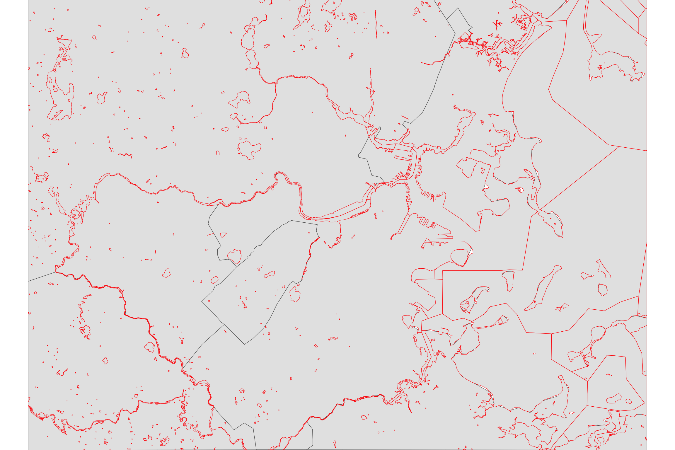
We can see the coastline and some of the Boston Harbor Islands, but the Charles River or the ponds around Boston are missing. Also, note that the resolution is very low. The tigris library calls the TIGER API using the default (maximum) resolution 500k (1:500k), which is not enough for our high-resolution map.
To get a better geography layer we are going to carve out the shapefile of the area of water from these polygons. The water shapefiles can be also obtained from the TIGER services. Fortunately, those water lines have a much better resolution than the counties shapefiles.
get_water <- function(county_GEOID){
area_water("MA", county_GEOID, class = "sf")
}
water <- do.call(rbind,
lapply(counties_MA$COUNTYFP,get_water))
##
|
| | 0%
|
|=== | 6%
|
|============= | 26%
|
|================= | 33%
|
|================= | 35%
|
|============================== | 61%
|
|================================== | 68%
|
|============================================== | 92%
|
|==================================================| 99%
|
|==================================================| 100%
##
|
| | 0%
|
| | 1%
|
|===================== | 42%
|
|==================================================| 100%
##
|
| | 0%
|
|======================== | 48%
|
|========================= | 50%
|
|================================== | 67%
|
|================================================ | 97%
|
|==================================================| 100%
##
|
| | 0%
|
|= | 1%
|
|== | 4%
|
|===== | 10%
|
|====== | 12%
|
|========================== | 52%
|
|================================== | 68%
|
|====================================== | 76%
|
|======================================== | 81%
|
|========================================== | 83%
|
|============================================== | 93%
|
|================================================ | 95%
|
|==================================================| 100%
##
|
| | 0%
|
|=========== | 23%
|
|======================= | 46%
|
|==================================================| 100%
water <- st_crop(water,
xmin=min_lon,xmax=max_lon,
ymin=min_lat,ymax=max_lat)
Let’s have a look at them:
ggplot() +
geom_sf(data=counties_MA)+
geom_sf(data=water,
inherit.aes = F,
col="red")+
coord_sf(xlim = c(min(bbx[1,]), max(bbx[1,])),
ylim = c(min(bbx[2,]), max(bbx[2,])),
expand = FALSE)+
theme(legend.position = F) + theme_void()
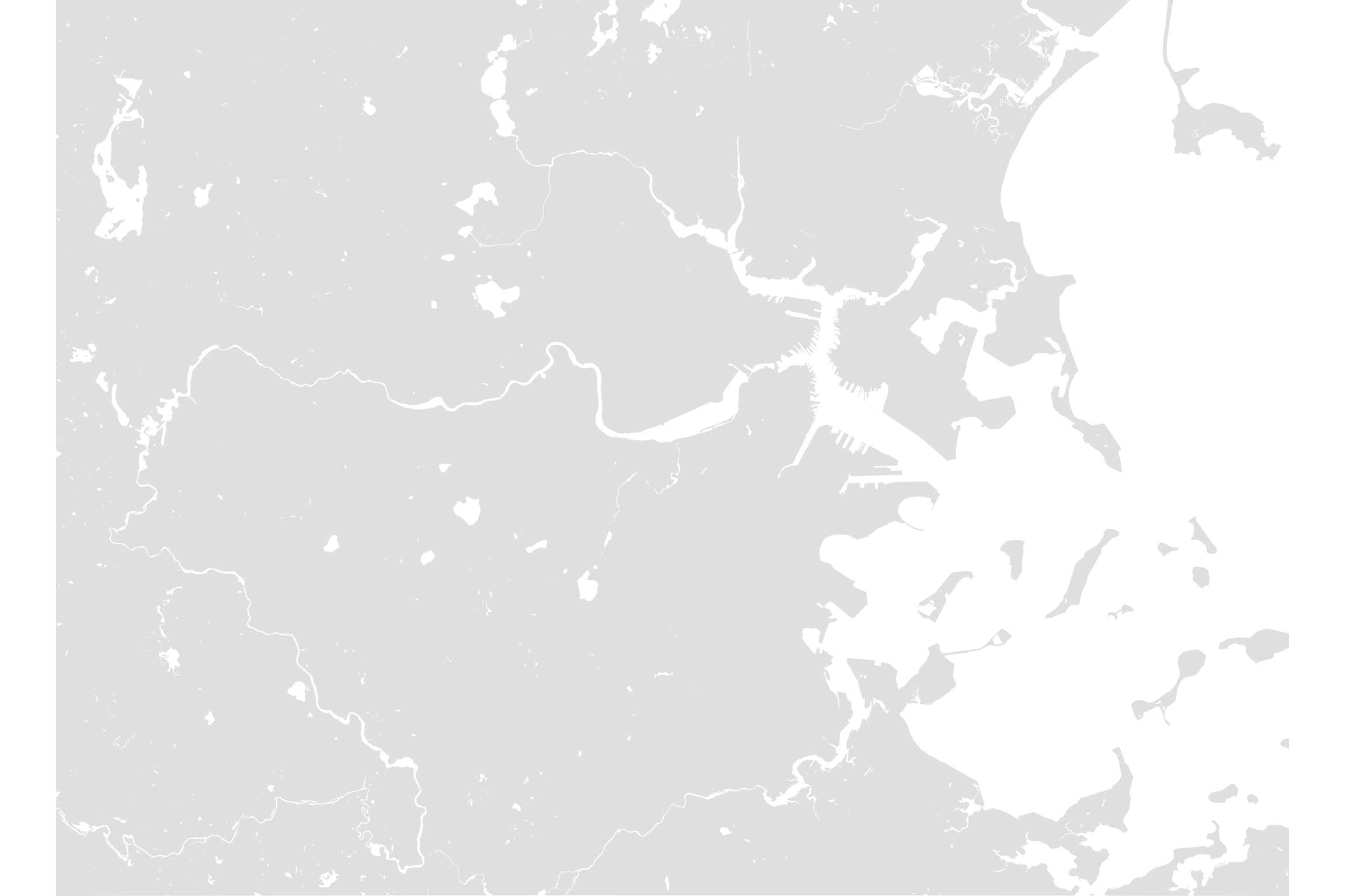
Finally, let’s carve out the water polygons from the counties polygons.
st_erase <- function(x, y) {
st_difference(x, st_union(y))
}
counties_MA <- st_erase(st_union(counties_MA),water)
which looks like this (not showing the lines between counties)
ggplot() +
geom_sf(data=counties_MA,
lwd=0)+
coord_sf(xlim = c(min(bbx[1,]), max(bbx[1,])),
ylim = c(min(bbx[2,]), max(bbx[2,])),
expand = FALSE)+
theme(legend.position = F) + theme_void()
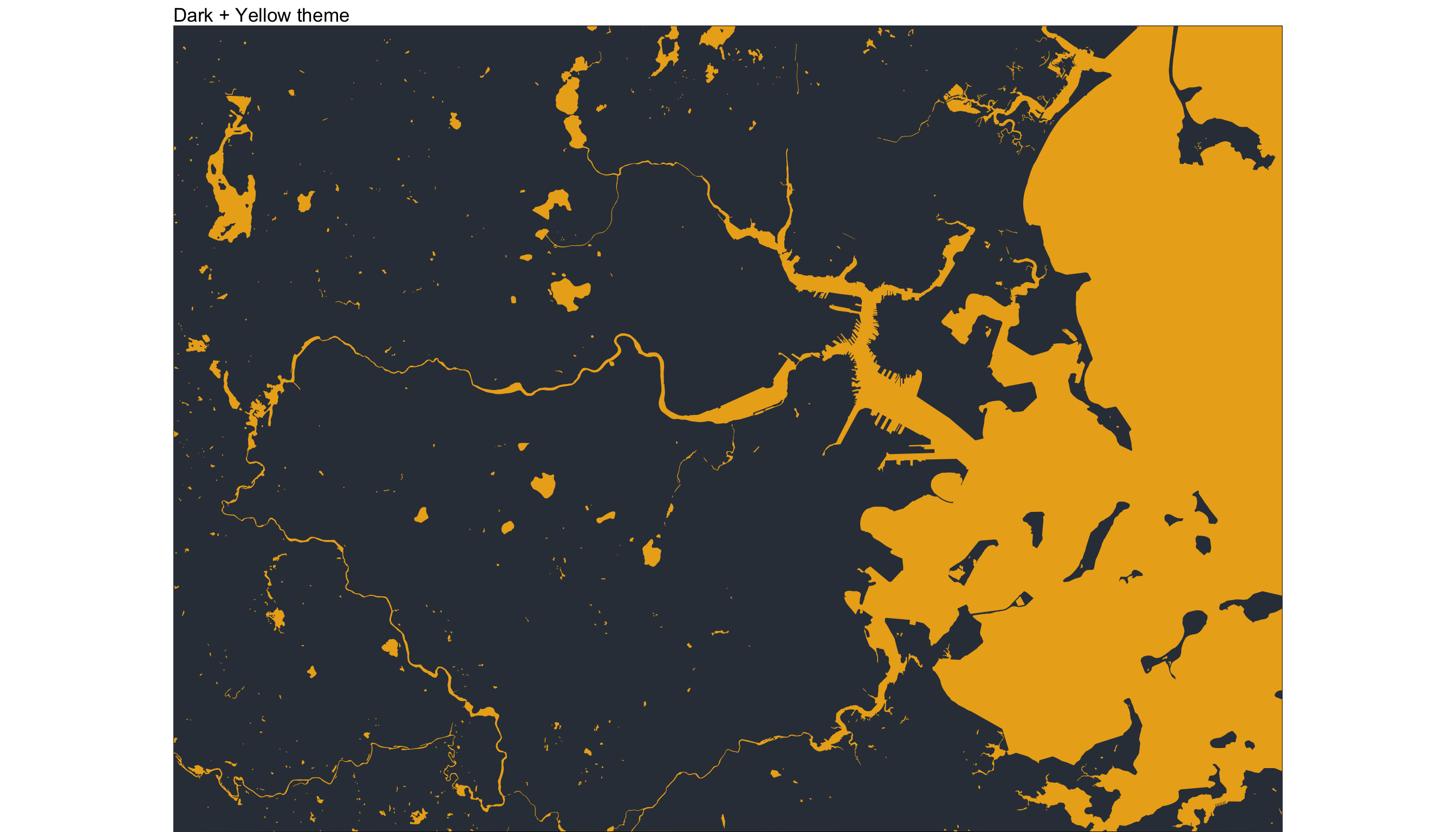
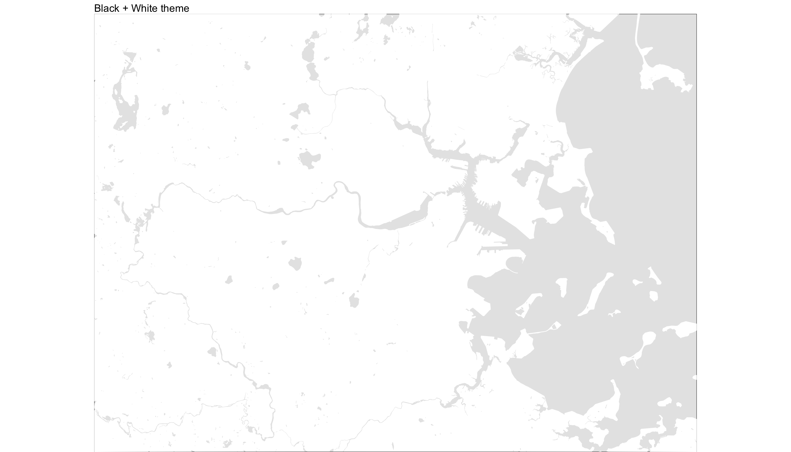
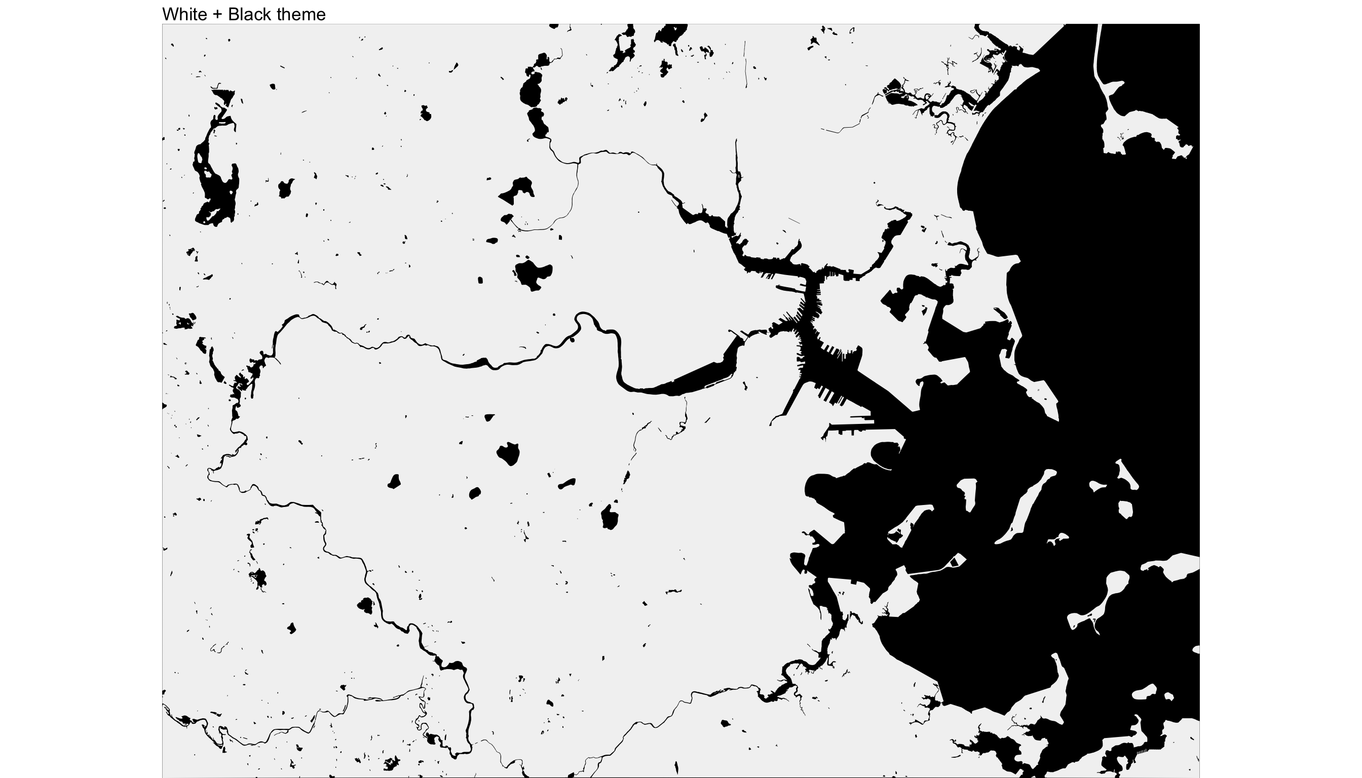
We can play now with the different colors for the water or land. Apart from the one above, I like these combinations (you might notice still the lines between counties. Don’t worry, they disappear when we print them in large format):
ggplot() +
geom_sf(data=counties_MA,
inherit.aes= FALSE,
lwd=0.0,fill=rgb(0.203,0.234,0.277))+
coord_sf(xlim = c(min(bbx[1,]), max(bbx[1,])),
ylim = c(min(bbx[2,]), max(bbx[2,])),
expand = FALSE)+
theme(legend.position = F) + theme_void()+
theme(panel.background=
element_rect(fill = rgb(0.92,0.679,0.105)))+
ggtitle("Dark + Yellow theme")
ggplot() +
geom_sf(data=counties_MA,
inherit.aes= FALSE,
lwd=0.0,fill="white")+
coord_sf(xlim = c(min(bbx[1,]), max(bbx[1,])),
ylim = c(min(bbx[2,]), max(bbx[2,])),
expand = FALSE)+
theme(legend.position = F) + theme_void()+
theme(panel.background=
element_rect(fill = rgb(0.9,0.9,0.9)))+
ggtitle("Black + White theme")
ggplot() +
geom_sf(data=counties_MA,
inherit.aes= FALSE,
lwd=0.0,fill=rgb(0.95,0.95,0.95))+
coord_sf(xlim = c(min(bbx[1,]), max(bbx[1,])),
ylim = c(min(bbx[2,]), max(bbx[2,])),
expand = FALSE)+
theme(legend.position = F) + theme_void()+
theme(panel.background=element_rect(fill = "black"))+
ggtitle("White + Black theme")
Putting geography and streets together
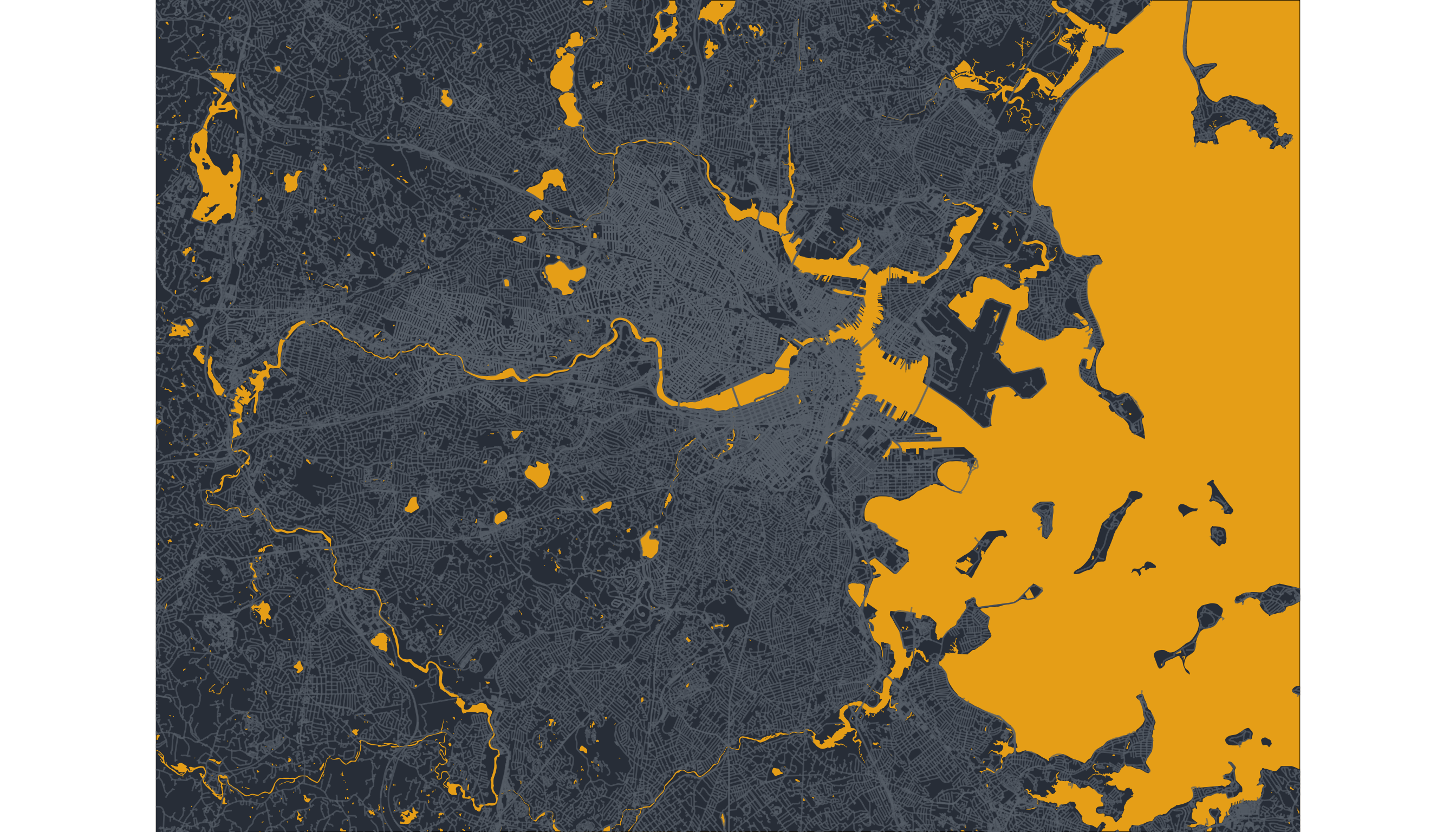
Once we have the geography, we can add the streets for our final streetmap:
ggplot() +
geom_sf(data=counties_MA,
inherit.aes= FALSE,
lwd=0.0,fill=rgb(0.203,0.234,0.277))+
geom_sf(data = streets$osm_lines,
inherit.aes = FALSE,
color=color_roads,
size = .4,
alpha = .65) +
geom_sf(data = highways$osm_lines,
inherit.aes = FALSE,
color=color_roads,
size = .6,
alpha = .65) +
coord_sf(xlim = c(min(bbx[1,]), max(bbx[1,])),
ylim = c(min(bbx[2,]), max(bbx[2,])),
expand = FALSE) +
theme(legend.position = F) + theme_void()+
theme(panel.background=
element_rect(fill = rgb(0.92,0.679,0.105)))
Adding personal mobility
As I said before, those maps are beautiful already. But I wanted to give them a more personal touch. As part of our research, we have been studying how people move in urban areas. Using high precision and anonymized data, we have understood how segregation happens on our streets, neighborhoods, working places. One of the things we found is that even if we happen to be in the same area, we tend to segregate ourselves and visit very different places. Even across the street! .
As part of that research, I’ve been collecting the locations that I visited in the last years in the Boston area. I used Google Location History which needs to be activated to work. Once it is activated, it starts saving the places you go to. You can even visualize your movements using the Google Maps Timeline. Or you can download it using the Google Takeout tool. Of course, if you don’t have access to your location history or is deactivated, you can always list the most relevant locations in the area you live and create a table with the right format (see below).
Once you download your location, you will get two sets of files. The first one is called Location History.json that contains a lot of location events (including latitute, longitud, timestamp) and a directory called Semantic Location History that has all the places visited by year and month. Make sure when you download your data from Google Takeout that this semantic history is enabled. We will use the semantic one since it contains a list of places visited (inferred by Google).
require(jsonlite)
require(data.table)
path <- "./Semantic Location History/"
files <- list.files(path,pattern="*.json",recursive=T)
get_locations <- function(f){
data <- jsonlite::fromJSON(paste0(path,f))
tlObj <- data$timelineObjects$placeVisit
loc <- cbind(tlObj$location,tlObj$duration)
tt <- as.numeric(loc$startTimestampMs)/1000
loc$time<-as.POSIXct(tt,origin = "1970-01-01")
#conver longitude & latitude from E7 to GPS
loc$lat = loc$latitudeE7 / 1e7
loc$lon = loc$longitudeE7 / 1e7
loc <- data.table(loc)
loc <- loc[,c("placeId","time","lat","lon")]
loc <- loc[!is.na(lon)]
}
locs.df<-rbindlist(lapply(files,get_locations))
The data includes the Google Id for the place, the timestamp of the visit its longitude/latitude position. Of course, I’m not showing you my personal data. This table you see below was generated sampling from a bunch of random locations in the Boston area around my working place (MIT Media Lab).
head(locs.df) %>% kbl() %>% kable_styling()
| placeId | time | lat | lon |
|---|---|---|---|
| ChIJ780101a191a | 2020-02-20 16:55:59 | 42.36126 | -71.08695 |
| ChIJ140101a191a | 2020-03-16 23:42:52 | 42.37321 | -71.09359 |
| ChIJ740101a191a | 2020-05-31 15:38:12 | 42.37020 | -71.06178 |
| ChIJ320101a191a | 2020-06-03 21:20:21 | 42.37311 | -71.12237 |
| ChIJ420101a191a | 2020-02-10 12:15:43 | 42.37220 | -71.06315 |
| ChIJ840101a191a | 2020-05-25 21:53:40 | 42.38635 | -71.22257 |
One way to add this personal information to the map would be to show the location points to the previous map. But for most of us, that would be just a bunch (hundred in my case) of points very close to each other. Since we already have the streets in the map, we will do something different: to plot the routes we took to go from one place to the next one. Two comments about this:
- The semantic locations do not include the routes taken to visit those places. Those can be calculated using the network of streets already downloaded.
- However, most of the days, we will only have one significant place visited. That means we cannot calculate any route that day. What we will do is to assume that each day starts at your home location and ends up in the same place, so at least you have two routes for those days with at least one location in the Google dataset. In my case, I will choose the MIT Media Lab as my home location (I spent a lot of time there last year, but it’s definitely not my home 😄)
We first create a function that return the routes between all the locations within a given day. To get the routes between two locations we used the function osrmRoute in the osrm package, which gives the shortest path between two points in the streets’ network.
require(osrm)
daily_routes <- function(date){
ll<-locs.df[as.Date(time)==date,c("lon","lat")]
#add home early in the morning
ll<-rbind(data.table(lon=-71.087658,lat=42.36),ll)
#add home late in the day
ll<-rbind(ll,data.table(lon=-71.087658,lat=42.36))
route <- NULL
for(j in 2:nrow(ll)){
p1 <- c(ll$lon[j-1],ll$lat[j-1])
p2 <- c(ll$lon[j],ll$lat[j])
oo <- osrmRoute(src=p1,dst=p2,returnclass = "sf",
overview="full")
route <- rbind(route,oo)
}
route
}
Note that those routes might not be the actual route taken to go between those points. The osrmRoute algorithm calculates the shortest path only.
And then we get all the routes for the whole period (this will take some time)
dates <- unique(as.Date(locs.df$time))
routes <- do.call(rbind,
lapply(dates,daily_routes))
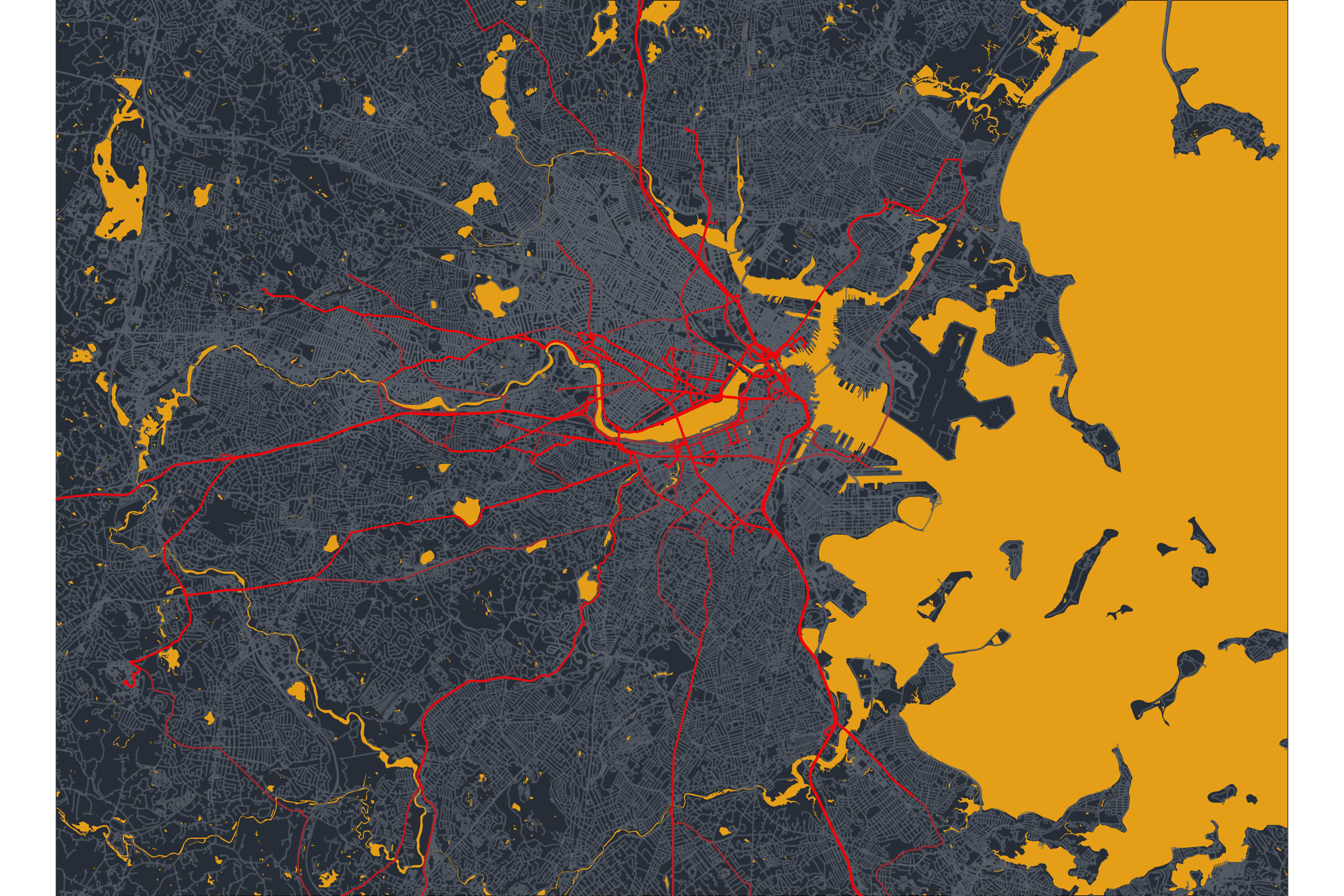
We are now ready to plot our geography + streets + personal routes.
final_map <- ggplot() +
geom_sf(data=counties_MA,
inherit.aes= FALSE,
lwd=0.0,fill=rgb(0.203,0.234,0.277))+
geom_sf(data = streets$osm_lines,
inherit.aes = FALSE,
color=color_roads,
size = .4,
alpha = .65) +
geom_sf(data = highways$osm_lines,
inherit.aes = FALSE,
color=color_roads,
size = .6,
alpha = .65) +
geom_sf(data=st_geometry(routes),
inherit.aes = FALSE,col="red",alpha=0.5)+
coord_sf(xlim = c(min(bbx[1,]), max(bbx[1,])),
ylim = c(min(bbx[2,]), max(bbx[2,])),
expand = FALSE) +
theme(legend.position = F) + theme_void()+
theme(panel.background=
element_rect(fill=rgb(0.92,0.679,0.105)))
final_map
Printing them out
Finally, let’s print it out in high resolution. In my case, I used 24 inches by 36 inches, but you can choose other sizes:
ggsave(final_map,
filename = "my_personal_map_art.png",
scale = 1,
width = 36,
height = 24,
units = "in",
dpi = 500)
Note the dpi = 500, which forces to save the image with high resolution (500 dots per inch). This is especially important if you want to print your poster in large dimensions. The file generated is large (around 40Mb).
The last step is to send to print or frame. You can use many services online to do that, but you need one that allows you to send such a big file. In my case, I ended up using the Mounted Canvas Print - 36" x 24" at vistaprint.
And here is the final result:

I hope you enjoyed my small project to produce personal map art with R.