Temporal networks with igraph and R (with 20 lines of code!)
**UPDATE**: the version of the R code in this post does not work with newer versions of the igraph package (\> 1.0). I have posted an updated version of this post here: [Temporal networks with R and igraph (updated)](/post/2015-12-21-temporal-networks-with-r-and-igraph-updated/). Please visit the new post to use the new code and follow the discussion there.
In my last post about how a twitter conversation unfolds in time on Twitter, the dynamical nature of information diffusion in twitter was illustrated with a video of the temporal network of interactions (RTs) between accounts. The temporal evolution of the network yields to another perspective of social structure and, in some cases, aggregating the data in a time window might blur out important temporal structures on information diffusion, community or opinion formation, etc. Although many of the commercial and free Social Network Analysis software have tools to visualize static networks, there are no so many options out there for dynamical networks. And in some cases they have very limited options for their “dynamical layout”. A notable exception is SoNIA, the Java-based package, which unfortunately is not updated frequently. Another possibility is to work with the Timeline plugin in Gephi. However there is no video recording possibility for the animations. In this post I will show you how to render the network at each time step and how to encode all snapshots into a video file using the igraph package in R and ffmpeg. The idea is very simple
- generate a number of snapshots of the network at different times using R and igraph, and
- then put them together in a video file using ffmpeg.
For 1. we need to draw the temporal network at each snapshot. Given the set of nodes and edges present at a given time, we have to find a layout for that instantaneous graph. The layout is a two-dimensional visualization of the nodes and edges in the plane and there are many algorithms to produce it. The package igraph contains mainly Force based algorithms like for example the Kamada-Kawai or Fruchterman-Reingold ones. Your millage may vary from one algorithm to another since visualizations depend on the number of nodes, clustering and/or community structure of the network. Sounds easy, but there two big problems with this approach:
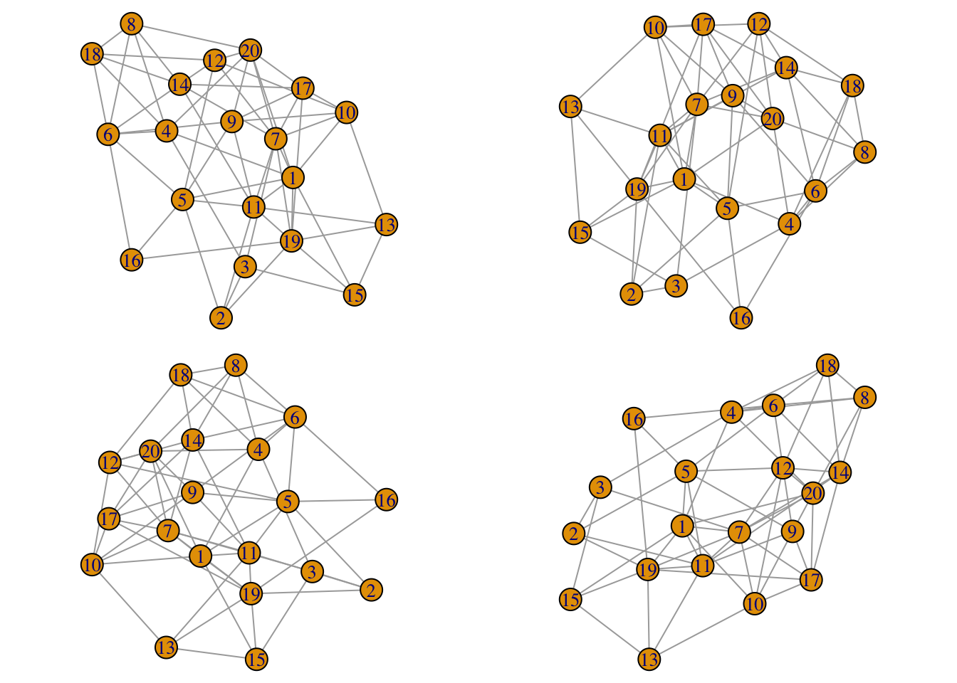
- Force based layout algorithms consist on performing a number of iterations aimed to minimize the energy of physical forces between nodes, and starting from an initial configuration which is typically a random initial condition. This means that even if your network does not evolve in time, successive calls to the layout algorithm will produce different results. In our temporal network case it means that the layout from one snapshot to the next one will be very different producing a swarm-of-bees kind of motion. For example, if you run this script you will see that the four layouts are very different:
library(igraph)
par(mfrow=c(2,2),mar=c(0,0,0,0), oma=c(0,0,0,0))
g = watts.strogatz.game(1,20,3,0.4)
for(i in 1:4) plot(g,layout=layout.fruchterman.reingold,margin=0)
Luckily, in igraph 0.6 we can specify the initial position of the nodes for some layout functions: layout.graphopt, layout.kamada.kawai and layout.fruchterman.reingold. My personal experience is that layout.graphopt crashes in this 0.6 version (although it works on 0.5), so we are left with the other two algorithms. The plan (taken from this original idea of Tamás Nepusz, one of the developers of igraph) is to use the layout of the previous snapshot as the initial condition for the next snapshot layout so we have a smooth transtion from one to the other. In the example above, the implementation will be the following using the start parameter:
par(mfrow=c(2,2),mar=c(0,0,0,0), oma=c(0,0,0,0))
g = watts.strogatz.game(1,20,3,0.4)
layout.old = layout.fruchterman.reingold(g)
for(i in 1:4){
layout.new = layout.fruchterman.reingold(g,params=list(niter=10,maxdelta=2,start=layout.old))
plot(g,layout=layout.new)
layout.old = layout.new
}

Now you can see that the layouts are similar. There are two new parameters passed to the layout function: niter = 10 specify the number of iterations (10) of the minimization of energy procedure in the force based algorithm. This number should be small, otherwise the final result will be very different from the initial condition. The same happens for the other parameter maxdelta=2 which controls the maximum change in the position of the nodes allowed in the minimization procedure.
- The other problem is that in a temporal network nodes and/or edges appear and disappear dynamically. Thus the time dependent graph might have different number of nodes and/or edges from one snapshot to the next one. This means that the layout at a given snapshot cannot be used as the initial condition to generate next time layout, since the number of nodes can be different. My solution to this problem is to consider all (past/present/future) nodes/edges when calculating the layout but to display only present nodes/edges in the plot by making past and future nodes/edges transparent. This trick allows the reutilization of the layouts between steps, but it will produce a more or less steady visualization in which the layout at any given time is not related to the instantaneous structure of the temporal graph. To overcome this problem we take advantage of another property of force based algorithms: nodes which are connected attract each other along the edge. At a given instant, we could then modify the attraction between nodes along edges depending on whether the the edge is not present. In igraph 0.6, only the
layout.fruchterman.reingoldhas this possibility through the parameterweights, a vector giving edge weights which are use to multiply the attraction along the edge. For example we could set weight equal to one if the edge is present and use zero weight for the rest. This will produce a layout in which present nodes are tightly connected while the past/future nodes are repelled from them. This effect dramatically highlights the appearance and disappearance of nodes, but could create too much confusion if there are many of those events.
To test this ideas, we will work an important example in the theory of complex networks: the preferential attachment mechanism to generate scale-free networks, i.e. the Barabási-Albert model. In our implementation, we keep the mechanism very simple: starting from an initial core of nodes, at each time step we add a single node that connects to m existing nodes which are selected proportionally to the number of links that the existing nodes already have. This mechanism leads to heavily linked nodes (“hubs”) together with a large fraction of poorly connected nodes. A particular realization of this model can be found in the file edges.csv below. The structure of the file is simple
## id1 id2 time
## 1 1 2 1
## 2 1 3 1
## 3 2 3 1
## 4 5 3 2
## 5 6 2 3
## 6 7 2 4
each line of the form id1 | id2 | time indicates that a link between id1 and id2 appears at a particular time. Depending on the context this might represent that the tie was activated at that particular instant (for example if it is a RT between two twitter accounts) or that it was the time in which the edge appeared first (like in our Barabási-Albert model). Here is the code to generate the snapshots and producing a PNG picture for each of them:
library(igraph)
#load the edges with time stamp
#there are three columns in edges: id1,id2,time
edges <- read.table("edges.csv",header=T)
#generate the full graph
g <- graph.edgelist(as.matrix(edges[,c(1,2)]),directed=F)
E(g)$time <- edges[,3]
#generate a cool palette for the graph
YlOrBr <- c("#FFFFD4", "#FED98E", "#FE9929", "#D95F0E", "#993404")
YlOrBr.Lab <- colorRampPalette(YlOrBr, space = "Lab")
#colors for the nodes are chosen from the very beginning
vcolor <- rev(YlOrBr.Lab(vcount(g)))
#time in the edges goes from 1 to 300. We kick off at time 3
ti <- 3
#weights of edges formed up to time ti is 1. Future edges are weighted 0
E(g)$weight <- ifelse(E(g)$time < ti,1,0)
#generate first layout using weights.
layout.old <- layout.fruchterman.reingold(g,params=list(weights=E(g)$weight))
#total time of the dynamics
total_time <- max(E(g)$time)
#This is the time interval for the animation. In this case is taken to be 1/10
#of the time (i.e. 10 snapshots) between adding two consecutive nodes
dt <- 0.1
#Output for each frame will be a png with HD size 1600x900 :)
png(file="example%03d.png", width=1600,height=900)
nsteps <- max(E(g)$time)
#Time loop starts
for(ti in seq(3,total_time,dt)){
#define weight for edges present up to time ti.
E(g)$weight <- ifelse(E(g)$time < ti,1,0)
#Edges with non-zero weight are in gray. The rest are transparent
E(g)$color <- ifelse(E(g)$time < ti,"gray",rgb(0,0,0,0))
#Nodes with at least a non-zero weighted edge are in color. The rest are transparent
V(g)$color <- ifelse(graph.strength(g)==0,rgb(0,0,0,0),vcolor)
#given the new weights, we update the layout a little bit
layout.new <- layout.fruchterman.reingold(g,params=list(niter=10,start=layout.old,weights=E(g)$weight,maxdelta=1))
#plot the new graph
plot(g,layout=layout.new,vertex.label="",vertex.size=1+2*log(graph.strength(g)),vertex.frame.color=V(g)$color,edge.width=1.5,asp=9/16,margin=-0.15)
#use the new layout in the next round
layout.old <- layout.new
}
dev.off()
As you can see the edges present before time ti are colored in “gray” and weighted 1 while the rest are transparent rgb(0,0,0,0) and weighted 0. For the nodes we have used the function graph.strength that calculate the sum of weights of adjacent edges of a node: note that if at a given instant a node has no active adjacent edges, its graph strength is zero and thus the node is transparent. Otherwise it is colored as in the vcolor vector. Final step is to encode this images into a video format. To that end I have used ffmpeg which can be install in linux, windows or mac. The following command line in a terminal shell produces a video file output.mp4 in the mpeg format:
ffmpeg -r 10 -b 20M -i example%03d.png output.mp4`
The first -r 10 flag controls the rate of frames per second (fps), 10 in this case, while the -b 20M sets the bitrate in the output (set to a large value here, 20M). The result is the following video
Done with 20 lines in R! I’m sure you can beat me with some other R tricks and many ways to improve this visualization. I am eager to know your comments. Please!